LIGHT AND SOUND ART CENTER

This project has been our unofficial semester-ending assignment. As some of you may remember, I mentioned that this certain project is somewhat connected to the previous one. The thing is, that this project is actually in the building that borders to my previous alley house project. In this assignment, we were to create rooms and spaces for different artistic centers - Once again, the type of art within the center, was chosen at random, and my assignment ended up being a light and sound art center. Inside the building, there are only two given openings - One in the top, which is the length of the building, and two meters high, and one in the bottom, again the length of the building and also the one that functions as the entrance to the art center. Unlike our previous assignments, this time we were besides a model and a poster, to make a little film of some sort (with only using our model) to show the effects and looks of our rooms and spaces within the center. Here is what I ended up making: (MUST BE SEEN IN FULL SCREEN! And unfortunately the quality is really poor compared to the original, also there is no sound, but don't worry, that's how it's meant to be.)


Given the assignment of working with a center for light and sound, I automatically decided to focus working with a room and space that makes as great use of light effects as possible. At first I wanted to create a rather complex structure of reflective surfaces that would "wrap in" the entire interior room, and within its wraps, create small (and large) exhibitional rooms. This concept was mainly created using computer programs, so once I attempted to create an analog model, I realized that the task would be practically impossible (well not impossible, but really, really troublesome and challenging). While attempting to build the sketch model, I created this one very simple surface, that made me realize things I haven't thought before. It seemed that this one rather simple surface (practically a paper folded and trimmed), created magnificent lighting effects, while at the same time managing to create just about all the needed rooms in the project!


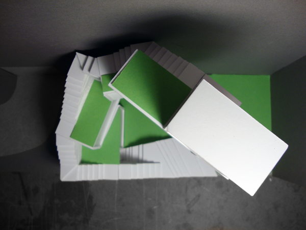
The result was the above structure. Note that the shape that seperates the rooms is actually one big element, that is folded. Of course, none of these folds are made at random - Let me explain. On the left side, you have this colossal, open space, where the above folds are designed to reflect natural lighting downards, doing so without allowing direct lighting. The idea was to create a monumental space, with soft lighting, such as that of a cathedral. Call it a Temple of Light if you will. This huge space is to serve as a space for the larger light art installations, and also a gathering hall for receptions, events and other such matters. To the far, right, lower corner, you have the entrance to the center (this isn't visible here, due to the ramp).


The next space that is created is more of a transition between the colossal light area, and a dark ramp, that is intended especially as an area for the sound art, as this area is to have special acoustic properties. This transitional space, is one that brings both medias - light and sound - into one area. It is also in this area that the complex dividing surface of the building is seen best, thus also serving as an observation point for those who also wish to admire the architecture, besides admiring the contents of the light and sound art exhibitions. Notice also that the entry point on the left side, is a mere two meters wide, in order to create intimacy in this room, despite the great opening towards the large hall on its left. Furthermore, I believe I forgot to mention the materials I'm using here. The building itself is an old transformater building, so the interior is plain and boring. I have chosen to keep the original, rough concrete floors and walls, and the interior addition (the reflective surface) is to be a of a high-gloss surface. That means that the surface not only manipulates the lighting in the enourmous room, but also manipulates the acoustics as well. I keep mentioning the room as colossal, since the dimensions are 18 meters of height, 23 meters in length and 9 meters in width.


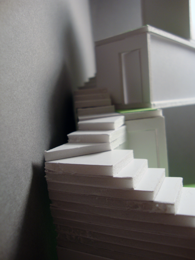
Finally, one enters the tunnel/ramp part of the center. It is in here that the sound art is to experienced, while one moves along a mystical hall, that seems to continue for kilometers (its actual lenght is about 20 meters). It is this effect of uncertain length that allows one to lose oneself in a mystical experience of sound art and not knowing how far to go. I have intended the sounds to change the further you go (this is possible due to new technologies - as to border the radius of the sound). Once the visitor starts to feel the ceiling and walls cramp up around him or her, the visitor will understand that this ramp has been an illusion, but might never the less start crawling towards the very end, where even more sound art installations are to be heard! One can say that the brave visitors get an extra experience of the sounds art installations if they dare venture to the borders of the ramp. 


As far as things go on the personal level, this project means a lot to me. To me it as a milestone in my study, and the timing of it being at the very end of the semester is perfect. For once I am absolutely satisfied with a project of mine, and as a matter of fact, rather proud of it even. Fortunately the opponion of my professors was likewise, and critique went fantastic this time, with them not having said a single bad thing about the project (the film itself was pointed to have a few flaws, but then again, I'm an architecture student, not a film producer, so that sort of thing didn't mean much to me). I put everything I have learned and avoided all my mistakes from earlier in the creation of this structure, and it really has been a rewarding process. Also my understanding of room and space creation has rocketed during the process, and having worked analog almost all of the time has opened my eyes to things that I hadn't thought about at earlier times. The work with contrasts between light and dark and the huge and the tiny scales has really enlightened me, and the things I've worked with in this project, are ones that I'll take with me throughout the rest of my study. And so, the first semester ends with a rather happy ending!

- Andy Minchev

STAIRWAY HOUSE

This is my latest project from the university, and it was due complete by the end of December 2010. The focus in this project has been to work with limited space at a challenging location, while also making a design that is specific to a certain individual. Our site of the building was a tiny, narrow alley in Copenhagen, surrounded by 14-18 meter tall buildings, where natural lighting was rare and the views provided were boring and unaesthetic. We were given specific volumes for four rooms - Bathroom, livingroom, kitchen and bedroom - And were from these masses to create a single-person home. The person who was to live in the structure was given to us by random - Each with a different personality. Below is a picture of the actual site.


Now before I proceed to my design process, it is vital for you to understand the personality of the inhabitant, since it is the thing that has led me to my final design. (Do note, that this is a fictious person, made up to create a more realistic architectural exercise. The inhabitant - Sofie, as she is named - is a young 30-year old woman. She has by the age of 30 already had vital job positions in art and sculptural centers in metropolises such as New York and Berlin. Her newest and current job at the time of the project is that of a head-manager of a center for light and sound art in Copenhagen (our current architectural project at the time being - I'll naturally post on it once it is complete). As you may have noticed by now, Sofie seems to have a rather busy lifestyle, and a personality that probably favors her work, rather than her sparetime interests. This has been a very vital element in my design of her new home. Below here, is a step by step guide to the process.


Now as you can see on the illustrations above, I quite simply start of by sorting out the different room volumes. Since there is very little lighting in the narrow and dark alley, I have chosen to give the structure as much height as possible - This I have done by starting off by stacking the volumes on top of each other, thus creating a maximal height (shown on the top right illustration). As i gain height, I notice that the structure becomes slightly dull, and that it is a pity that the roofings aren't open for use as terraces, so I shift every floor so that an exterior space is created on each of these floors (illustration at the bottom left). Finally since the structure needs to fit in the narrow alley, I turn the entire structure, so its width fits in the site. This twist in the alley is not just to make the structure fit in, but also to create a more exciting space, so the inhabitant doesn't have to stare at plain old walls all the time. This twisty design is by no means accidental either, since it symoblizes Sofie's busy and dynamic lifestyle. Furthermore, the entire structure is a symbol of her needs - Her office and work space are located at the highest block, while her bedroom - Her sanctuary of rest - Is located at the very bottom. These placings of rooms represent her needs and are prioritized by her goals in life, putting her job at the top.


Now in order to connect all these five rooms, I created a staircase system that connects them, as illustrated on the facade drawings above. The staircase symbolizes, although almoste litterally, Sofie's fight to reach the top in her line of work, where on top of the structure, her office stands almost as a temple-like monument, overlooking the climb upwards. You may also have noticed that this staircase system may be rather unpractical, and honestly, it is. Do mind that this was an excercise with working under rather challenging conditions, and the spacial design was according to our professor more vital than that of one that is realistic in this certain project. I had planned an exterior construction that would cover up the staircase system, but was advised not to use it, since it would lead me away from the vital excercise. Below are pictures of my final model, which took me ages to complete, due to the many, many troublesome stairs!


This project thought me a vital lesson with especially how important it can be to have a certain personality drive the project's design. In the very early stages of the project, we weren't given information about our inhabitant and were told to work freely with whichever shapes and forms we desired. At this stage I had great trouble finding the right design and was at certain points, well, completely lost. But after having revealed our inhabitant, it was a matter of very few days before I had found the exact design that I needed. It seems that the more possibilities and freedoms you have with the design, the harder it is to find the right one.

- Andy Minchev

WORKSHOP: BEE-QUARIUM

Shortly after our Bicycle Shelter project was complete, we had a workshop week at the architectural school, in which three different architects, from Denmark, Sweden and Norway respectivly, were invited to give us three different types of assignments, all focusing on our speciality: Sustainable architecture. All five education years (bachelors and masters) participated in the workshop week, and we were divided into three greater groups - one for each architect. Once in our groups, we were furthermore scattered into six minor groups, each focusing on different assignments within the main assignment. Our assignment leading architect was Cord Siegel from Hauschild-Siegel Architects.


The greater theme of our project, was to create an agriculturally productive building, that also includes 12 apartments for agriculturally interested citydwellers (urbanfarmers). The six different groups were given different assignments based on different types of agriculture. My group was given a rather different type of production, that is usually not very common amongst urban agricultural structures - An urban apiary and honey production building. Our group quickly learned the frightening facts of the amounts of plants needed to produce but the slightest amounts of honey (it takes several hundreds of thousands of flowers to produce less than 30kg of honey pr. season!), and therefore we decided to furthermore divide ourselves into yet two smaller groups. The idea of this, was that one of the groups would focus on a realistic production of honey and bee's wax, placing large apiary systems amongst living quarters in areas with vast ecological areas, while the other group would place no more than a single beehive, and create a structure that exhibits the ridicilous amounts of plants needed to support honey and bee's wax production in just a single hive!


In order to fit the 100.000's of needed plants and flowers, the easiest solution for us, was to plant them in a vertical direction, where the entire exterior facade is covered in vegetation. Amongst the 50 meter high vegetational tower, are 12 prefab apartment units of the size 120 square meters, placed between the vegetational planes, and sticking out from the structure. The irony of our structure, is that despite focusing on sustainable design, our tower can be said to be quite the opposite! In order to just water the plants, we have had to use just about every possible technology of water purification to be able to reuse water, so that ridicilous amounts of watering water is nulified. Our structure gathers rainwater, reuses all of the structure's water usuage - even graywater, and last but not least, it even gathers the plants' dew and evaporation! All these methods are used, so the building's bees have enough plantation to be able to produce no more than 35kgs of honey pr. year!


We have furthermore fixed an elevator and staircase system within the vegetational skyscraper, that allows the inhabitants to move freely through the structure in bee-free isolated areas. Each apartment floor furthermore has its own garden area, which is also isolated from the bees, and where the dwellers have direct access to bridge systems that follow the buildings facade, where the inhibatants can take care of the plants, and also admire the many bees  (just about 10 bees pr. square meter) that roam trough the un-isolated areas (assuming it's a structure for beekeepers, we believe that the inhabitants would have interest in observing the bees).


To sum things up, our project was, well, in many ways rather extreme. Our sister group that focused on a realistic honey production, that fortunately create a functional structure that managed to create several tons of honey and bee's wax pr. year, so perhaps it is a realistic productional concept. Our group however, intentionally aimed at failing a realistic production, since our focus was rather to illustrate to the public, how much vegetation is actually required for mere 35kgs of honey! As a matter of fact, our bee hive stands at the floor level of the building, in a way that it stands almost as a sacred relic, illustrating how much bees actually work, to produce so little. Of course, such a structure is ridicilously unpractical, and far from realistic, but the challenge of making such a project function in a "sustainable" manner, was the greatest lesson to be learned!

- Andy Minchev

BICYCLE SHELTER PART 2

Before proceeding to read this post, I would advise you to read the first
part of it first, if you haven't read it, that is.

After a long process and several minor projects in between the major bicycle shelter project, it is finally finished! The result may seem rather similar to that of the previous post, but most of the changes lie in the interior, and also in the exterior materials. Below is the final presentational poster: (Click on it for full size)


The changes in this final version of my project lie, as earlier mentioned, in the interior and material. First of all, I was adviced to rethink the interior, so it is more dynamic than the previous one, while somehow also keeping the building's simplicity. What I did was add a vertical floating staircase on one side of the building, that leads up to a sleeping platform - one that is cosier than the previous staircase sleeping elements. On the exterior, I only slightly changed the shape to an even more simple one, and also changed the material to concrete, in order to create an even more mystical and displaced structure in the natural landscape, while also allowing more flexible construction systems, such as the floating stairs and the sleeping platform.


As you may remember, my whole idea with designing this rather weird and simple box-shaped shelter, was to create a mystical and weird effect in the landscape, and despite great enthusiasm from the professors' side, the project was critiquely contently accepted due to its far too simple shape and also due to my Donald Judd prefrences. I too was very sceptical with the whole concept and at times even hated the box I created, but I sticked with it to the very end, experimenting with what the outcome of such a design would provoke. Below is also the final rendering of the building. Once again, the landscape is not that of the Southern Italian coast, but unlike my previous render background, this one at least depicts a coastal landscape, and also a natural landscape that is more common to that of the one that is originally present at the actual site of the project.


So to sum things up, the results of this project are rather mixed - and that for a good reason as well. Being my first project, it will always haunt me, both in negative and positive ways. Also, despite the result, it has thought me many lessons on how to work on such a project, that I have no doubt will be rather useful to me from now on. Some of these are first of all, that I shouldn't hurry to conclude to the design of my project before trying various different designs and functions. That is perhaps the most important lesson. Also, I have experienced that having different teachers judge your project, quickly ends up in a huge mess of different people's opinions, which results in you having to decide which advices are the best to integrate in your designs - And as we all know, there is no exact right or wrong in the architectural universe, so that can be quite challenging! Besides these lessons, I have learned many other minor ones, but those I won't mention here, but rather illustrate in my future designs! The first step has been taken, let's see where the next one will lead.  

- Andy Minchev


CITY SPACE STUDY

As you might have noticed, I haven't written in the blog for quite a while. So today I'll be suming all the latest works up in different posts, all in chronological order. This first one is a short two-day group project we had, in which we as groups, were given to different areas in Copenhagen, in which we were to study and analyze the local lightning, acoustic, climatic and other conditions, while also comparing the similarities and differences in the two areas. In our group, we were to study the huge greenhouse in Copenhagen's botanical garden and a new parking "green" parking building in the outskirt of the city centre. What you see below is our first page from a total of four A3 presentational pages, containing diagrams and photos of the sites (two of the girls from the group took the amazing pictures).


The first of the two sites - the botanical garden - was a rather interesting space. Due to its artificial rainforest-like climate, the change from interior to exterior is extremely dramatic. At the moment of entry, you are quickly soaked up in the moist, misty air of the area and also rather quickly made uncomfortable by the sudden dramatic change of temperature. Despite the sudden climatic change, which one can describe as rather uncomfortable, the climate is rather pleasant after one spends some time in the room. Naturally, natural lighting is abundant in the greenhouse due to obvious reasons, but an interesting element, was the rooms acoustics. Even though the room in itself is pretty spacious, the acoustics were in a way mysterious. This is amongst different facts, the fact that the mist and the plants in the room limit your line of sight, leaving you to wonder where sounds and voices are actually coming from. As a matter of fact, the mist in the room was at times so thick, that you couldn't see to the other end of the room! This effect was in its way surreal and rather amazing. (This effect is furthermore illustrated in our above photos of the room.) A diagram was also made by us to illustrate the way the building functions, but it was made in hand, so unfortunately I can't upload it here on the blog.


The above picture shows photos of our second location - The green parking house. As you may quickly notice, it has been nicknamed the "green" parking house, due to the vegetational growth on the building's exterior. Even with the building's green features, it is not one that one usually notices, due to its rather basic function, but we were left impressed after studying the building. Unlike many other carparking buildings, this one had an almost completely open facade, allowing the building to be almost entirely lit by natural lighting - A feature we found rather impressive. And despite its rough concrete look, the interior of the building was as a matter of fact rather pleasant, especially based on the fact that it is a mere parking building. This was mostly due to the building's living, breathing, green facade, which surprisingly effectivly integrates the rough concrete interior and exterior with the elegance of natural vegetation. Below is the third and last uploaded presentational page, which includes diagrams that illustrate how the building functions. I believe the illustrations should be clear enough, so I won't comment on the details.


To sum things up, this short project was rather effective, despite its rather short length. One can say that this was our first practical step to truely understanding a space in the city, and understanding how a space functions, no matter if it is interior or exterior. It may not have completely altered our understandings of spaces and rooms, but the process has thought us to notice details that we haven't thought of before - Some of which are most important to understanding architecture and the urban environment.

- Andy Minchev