Showing posts with label Projects. Show all posts

THE SOCIAL CITY

Our 4th semester project consists of a site in a Copenhagen suburb, on which a minor residential area is to be planned. The area of the site is called Hareskov By - a Copenhagen suburb that is located in a large forest area within the borders of Greater Copenhagen (as a matter of fact, the largest forest area within the latter).


Our first step in the project, was to write a program for our vision of the site - How dense should the buildings be? How should the area integrate with its surroundings? Who is going to live there? Due to the lovely natural surroundings of the area, I decided that familys with children (ages ranging from babies to teenagers) should be my primary group for the design of the area. Furthermore, the social life of the residential area was of great priority - This planning was strongly inspired by the theories of the Danish architect, Jan Gehl, who is well known for his urban strategies. With social design in mind, it was also a great priority of mine to integrate the new residential area, with the existing suburban area, in a way that the new and existing citizens can live in harmony, and so the new area contributes to making the existing area better, rather than creating problems or being isolated.


I like to work in areas with contextual surroundings, but on this site, I felt that there was a great lack of such. In order to comprise for the lack of context, I decided to design my houses as abstractions of the surrounding suburban sprawl. With different brick colors and patterns on the exterior, I decided to make my project a sort of village - a city within a city, if you will. Also, in order to make a more interesting and less linear site plan, I distorted the houses so that small spaces a created between the houses, as illustrated below:


Usually I keep writing vast amounts of text explaining the further details of my projects, but due to the great scale of this one, I'll keep it short this time, and let my illustrations speak for themselves.

Ortographics


Renderings


As for the crit of the project, the comments were generally positive. The plan of the residential area (especially the focus on the social structuring and the integration with the existing neighbourhood) received very positive comments. So did the interior planning of the houses (which I haven't been too detailed about in this post). As for the negative commentary, the professors were in doubt about whether the placement of my windows in the houses were right, and also whether the triple differences in both house shapes (there were three different house types) and the three different exterior patterns were a bit too much. All in all, the project received the second highest grade possible, and considering my effort (I often had times in the process where I felt stuck - this especially due to the lack of context in the area), I am all in all satisfied with the result.

That is all for now. With my bachelor year beginning tomorrow, there will be lots more to write about here in the blog. As a matter of fact, we're going to an exhibition in Louisiana Museum of Modern Art as soon as Tuesday (4th September), so a new blog update might be expected as soon as that.

- Andy Minchev

RESTAURANT PAVILION - HARESKOVEN, DENMARK

Last Friday, I finally presented my complete work. Our project was to be an independent extension to a restaurant in Hareskoven. Hareskoven is perhaps Greater Copenhagen's largest woodland area, and it is also the location of our project site. The existing larger restaurant building, is one that hardly makes use of its beautiful surrounding forest panorama. Furthermore, it hardly has any direct relation to the forest, rather than its situation, so I decided that my primary goals for the design of my project were to design a building that has closer relations to the forest, and also to be one that makes use of the woodland panorama.


Playing around with different shapes that would enframe a specific view towards the forest, while also making a sort of tunnel-like refuge to the wild forest, I ended up with the above shapes as my first concept. These shapes and their long V-roofs reminded me about the viking longhouses - litterally, long houses where entire viking village communities were housed under one roof. These longhouses (concept illustrated bellow) led to the grand idea of the rest of the project.


Having taken this conceptual twist and making it the focus of the project, I went on to use the sketch-model on the lower right side of the first illustration. I especially like this one, since it lived up to the tunnel-to-the-forest concept, while also following the form language of the longhouse idea. Furthermore, I was very satisfied with having the visitors first go down in a small, discrete entrance, and then having a huge opening on the other end of the tunnel, so they get a somewhat dramatic experience of the look towards the first, already as they enter. Below are the technical drawings:


As you can see, there is a major difference in the roof height from the entry point and by the end of the roof. It is also quite clear, that my design most certainly lives up to the name of longhouse! Following the social structure of the viking longhouse, my building is furnished quite simply, but with a great emphasis on social activity. My concept of this restaurant pavilion, is to have a different dining experience. Instead of having your food directly serve, as at normal restaurants, here the visitors come in groups, and together with a guide they are given food packages, that they, with assistance from the cook, cook together, thus creating a social activity through the cooking process. All this is achieved through a single, simple component, that is placed centrally in the building. This long component consists of a kitchen, a grill pit and finally a long table. Like the viking longhouses, there are no electric appliances whatsoever, just a grill pit, where the meats are grilled. On the kitchen component is a sink, which is the only appliance that requires an external source. Furthermore, guests are seated on two long concrete benches, placed along the long table, once again to bring the guests closer together, as part of the social experience. The smoke from the grilling rises naturally towards the ceiling, where five openings allow it to exit the building. During the cooking, the elevating smoke makes daylight from the ceiling openings (which by the way are covered with windows, which only open when the smoke needs to exit), become quite clear, thus creating a dramatic effect in the indoors. Below are two renderings, one of the exterior and one of the interior:


And a few photos of a 1:50 scale model I made of the project:


As for the criticism I got for the project, it was generally favourable towards my project. The dug-down discrete entrance was criticized, but mostly for the shaping of the staircase, that according to my teachers wasn't completely in harmony with the rest of the structure. I was also questioned about the wooden roof and finally wether the entrance area of the structure was too enclosed and and narrow. I have to agree with all the three mentioned things, that there is space for improvement there, but otherwise, I'm satisfied with the concept and the aesthetic appearance of the result.

P.S. We're now having a 3D Studio Max course, and by the end of next week, I'll have a far more advanced 3D rendering of this project to show!

- Andy Minchev

DESKTOP ORGANIZER

Our latest project differs from our usual everyday architectural work. Since our teachers showed interest in introducing us to the school's model workshop (a carpenters' workshop we have), we were given an assignment that was intended to further our skills and knowledge within the world of model carpentry. Our project was to design a 1:1 scale desktop organizer, that suits our own personal needs (as already implied, we had great freedom in doing this, and the main task was to get to know the modelling tools better). Personally, I'm a person who is rather fond of order, and usually I try to keep my desktop as clean and tidy as possible, bringing to the table only the things I need at the moment. Therefore, a desktop organizer wasn't that vital to me, and I decided to make it a bit more of a piece of eyecandy rather than a more functional object, such as a drawer, which by the way, many of my classmates made. The object I created was intended to function as a staffelli - A place where I can place my drawings and always have them within my sight, so I easily can focus on how my sketches, ideas and concepts evolve throughout the design process. Bellow are its technical drawings:


The shape is actually an almost triangular surface, which has been folded into a rather sharp-edged dynamic figure, which is supposed to give an illusion of a piece of paper leaping out of the desktop surface (which is to become white, but currently black). All edges are sharpened and are 45 degrees on the sides, which furthers the above mentioned illusional effect. The object is constructed from MDF wood (which is seen on the backside of the object) and covered with a glossy cardboard surface (seen on the front - the part that gives the leaping paper effect). Below are photos of the finished design.


P.S. I recieved almost entirely positive criticism for this project, and it is perhaps the first time I'm completely satisfied with a project. (The second place going to my Light and Sound Art Center, which surprisingly had a very similar form language as this project). I'm looking forward to find out if such sharp and dynamic shapes are a thing I should work with further on, when logically applicable of course!

- Andy Minchev

LANDMARK DESIGN FOR YARD GALLERY

This project was something really special for all of us in our class, since the most suitable project was selected to be built in real life. We were to each design a project that we believed was suitable for a site and the image and needs of an art gallery. But it wasn't as simple as that. We were given a maximum of 110 abandoned sleepers to work with (the wooden elements that are placed under railroad tracks). With these sleepers, we had the freedom to design as we wished, as long as it was a realistically buildable structure.


Now in order to understand my personal concept for the site, first, I have to explain the condition of the sleepers. The condition of the sleepers was one that showed great decay. They had been used for railways, and were even somewhat soaked in diesel fuel, which is one of the reasons for their dark colour. With the gallery being absolutely white on the interior, I thought that the sleepers as they were would create a great contrast between the interior and exterior. Furthermore, this frontside of the gallery was rarely used, due to a lack of space for human interaction, and two front doors, that unfortunately were unconnected. I decided to solve both these problems by creating a rather simple, yet very flexible and practical terrace, that connects both doors, creates a space for interaction (where chairs and others can be placed as needed) and also creates an abstract extension of the gallery, in an outdoor space that contrasts the interior, while still preserving the industrial area feel to the area. 


Also, like the minimalistic and minimal interior of the gallery (as seen above) that forces focus on the displayed artworks, my exterior space is kept low so that the human interactions on the terrace are the true focus, with the surroundings remaining as they are. During the entire process, I had hundreds of ideas for the site and couldn't make up my mind until about 24 hours till the final presentation, so some details in my project were unfortunately left out. The result of my simple concept is the rendering bellow:


My project seemed to grab the attention of the gallery owner (especially due to the contrasting effect), but unfortunately wasn't chosen for construction. The honour went to my good classmate, Helge, who designed a project that was an abstraction of roots crawling out of the ground, forming benches and other inviting shapes. No doubt a project worthy of construction if you ask me! Helge may have the honour of having his first built project, but as a class, the experience of building it together has been just as exciting for us. Check out the links bellow, they show all the other projects, Helge's winning project and furthermore, the works of the gallery are really interesting, so check them out!

Further reading:
http://www.yardgallery.dk/ (official site/blog)
http://www.yardgallery.dk/?p=790 (winning project)
http://www.yardgallery.dk/?p=798 (other projects - mine's the first one here)

- Andy Minchev

BATHING COMPLEX ON HVEN - PART 2

As earlier promised, I wrote I'd do a post on my final project for the semester. Now due to various activities during the summer break, and generally being busy most of the summer (and at times, just plain lazy), I have, as you may have noticed, really delayed this post. But we just officially started our second school year and our third semester, so I believe it is time to start posting on the blog once again. With that said, here is the final result of my second semester project.


Before I proceed to explain my project, here is a quick briefing to the goals of the assignment. Our assignment was to design a "bathing complex" on the little Swedish island of Hven. This so called bathing complex was to feature a sauna building, a stairway that connects the beach to the top of a cliff, a bridge that leads out to the water for swimmers, a few tiny "cottages" for changing clothes and swimwear, and finally, the odd one out - a sundial as a sculptural element.


The theme I chose to work with in this project, was the contrast between the man-made and the wilderness of nature. This theme was chosen in order to illustrate how we can build in harmony with nature, despite building with shapes and masses that stand out greatly from those seen in nature. More background story on this 
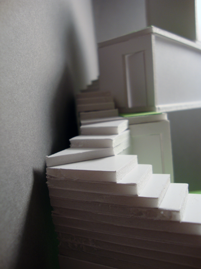
can be read at the former post to this project. Anyway, the first two elements of the bathing complex that I'll comment on, are the bridge and the stairway to the beach. First of all, I decided to make these as one long continous element, that stretches from the top of the elevated area, through a forrest, and finally into a bridge that slowly sinks down to the water. This pathway was to be designed in polished wood, so its surroundings could be reflected, while also illustrating a man-made pathway, which is so thoroughly crafted, that it stands in great contrast to its wild and untamed natural surroundings. The entire pathway is a perfect highway-like straight line, that cuts through the forrest, but minds vegetation by having gaps and holes in its structure where there are trees and bushes - this to illustrate how it minds nature, and to symbolize a harmony between the man-made and the natural, despite the great contrast in form and shape. The two pictures above are renderings of the pathway throught the forrest and the swimmers' bridge.


The next element, is the sauna house. Once again, I've stuck to the man-made vs nature contrast, and decided to give a really iconic (almost sculptural) man-made shape to the house. It is, as you can see, extremely simple in its shape, and the proportions have been thoroughly specified, to illustrate those of a classical V-roofed house. The whole building is made of polished wood, which once again reflects its surroundings. Furthermore, the only light opening is at the roof, thus giving the building a very solid and somewhat mystical shape, which adds to the contrast effect I tried to achieve. The sauna is shown above.


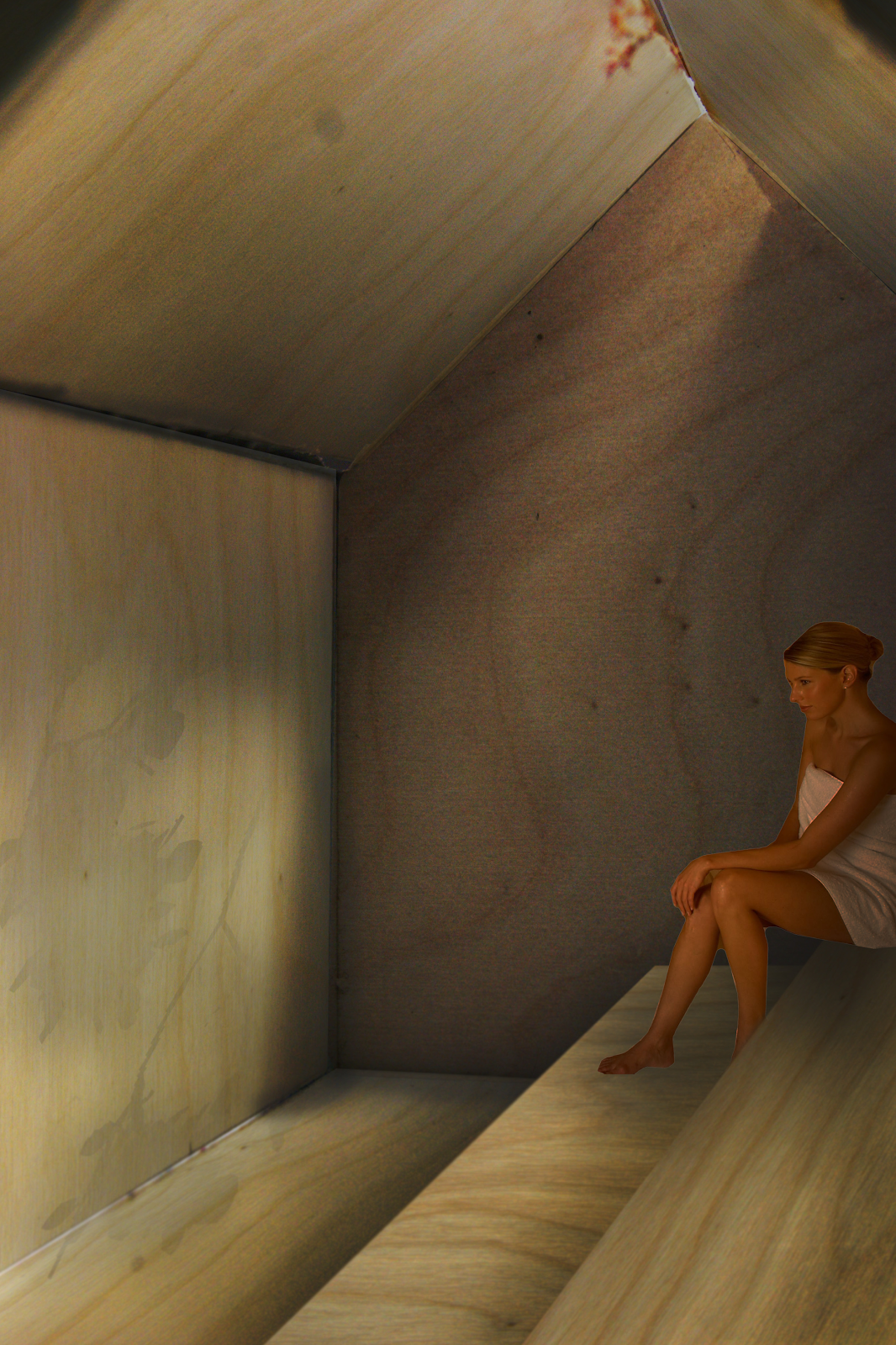
The interior is just as simple, except that the walls here aren't polished like the exterior. As you can see, light comes from the opening above, where the shadows of the leaves and branches of the trees outside are projected on the wall of the sauna. The interior in itself is a man-made oasis, that is completely isolated from the forrest, so I choose to have the leaf and branch shadows as an element that acts as a reminder to the natural surroundings of this sauna escape. The sauna building and the pathway through the forrest are connected as a complex, though not directly - The sauna is intended to be a bit hidden from the path, so it provokes the curiosity of passer-bys. The idea of these three elements being combined, is to create an area in the forest and beach, which are intended as an abstract experience that explore the contrasts between the man-made and the natural, while also giving a rather different sauna and bathing experience. The above image illustrates the sauna's interior.


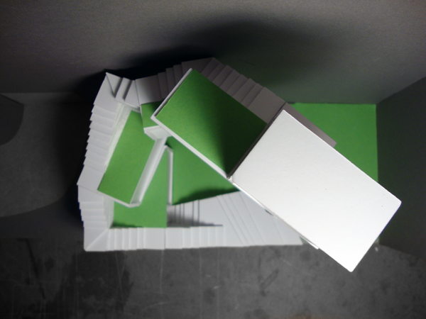
Moving further up north on the island, to a beach right next to a small fishing village, is a different bathing experience. Unlike the contrasty nature vs civilization experience given in the forrest further down south, this beach is intended for a more traditional beach experience. The only addition to the coastal landscape here, is five concrete cottages for swimwear changing. These cottages have the same shape form as the sauna, but instead of openings in the roof, they have them on their sides instead. These openings are so close though, that no matter how you stand on the exterior, you can't look in, assuring privacy to those inside. The shape and arrangement of these cottages is inspired by a few small harbour cottages at a nearby fisher's harbor. I chose concrete here, because they first of all are placed next to one of many old abandoned bunkers on the island, and second of all, so that the interior can be kept cool during the warm summer months, when swimmers are most likely to use these cottages. A section of the cottages is shown above.


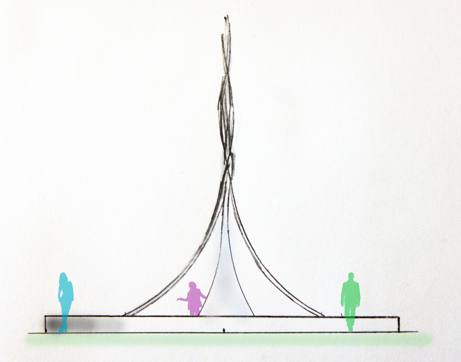
And now to the final element, the sundial. After several discussions with our professors and my classmates, I concluded that despite several active and monumental areas on the island, Hven didn't have a defined central area for meeting and activities and such. I decided therefore to define such a place by creating a monument of the sundial. The result was a sculptural shape, which featured four metal lines. Each of these lines pointed towards the four largest cities in the Øresund sound, where the island is located (Copenhagen, Malmø, Helsingør and Helsingborg). This was to illustrate that the island of Hven is in its way a center for the entire sound, despite its little size. This sculpture was furthermore placed in a low pool, where one would be able to dip one's feet for a little cool-down, and it would also be surrounded by a round bench that circles around the monument, in order to create a hang-out and meeting spot with seats and such. Above is a facade drawing of the monument, and below a plan.


Having explained all my ideas, it's time for a quick resumé of the critique I was given. Despite rather positive reception from most of the teachers during my process, the comments were different at the ending critique. We had a guest critic, who was very uncertain about how these elements were connected to one another. We were told that we didn't have to have any direct connection between the different elements, but perhaps she wasn't told of this. Another teacher was critical towards my choice of material in the first three elements, especially the short-lived glossiness of the polished wood. I have to admit, that he is most right in this comment, and without maintanance, the whole concept of contrast in the forrest would quickly fade away, leaving a questionable effect to the whole idea. The most criticized element though, was the sundial. I have to admit that my skills with designing monuments are minimal, and this was my very first attempt, but I didn't expect the critique to be so strong. It was pinned out as a, and I quote, "a cheesy Soviet-era monument". It's a shame they weren't more precise as to why it has failed as a monument and an element that defines a central area. 

This whole project has been a great experiment for me, since I'm used to working after a more logical and functional method, rather than this sort of abstract/mystical experience. I don't regret trying it out, but I have also learned by this attempt, that my strength lies in my more functional sort of work. With that said, I believe all that needs to be said, has been said.

Further reading:

- Andy Minchev

BATHING COMPLEX ON HVEN (PART I)

If you have been wondering why it's been such a while since I've posted about any school projects, it's because we're on to a big one right now. As a matter of fact, it's our semester project. Such projects do of course take time, and my case has been no different. But since it takes time, I would like to at least inform you of my work so far. The finished project is due to the 10th of June, and the presentations on the 14th and 15th, so the finished result will be posted sometime by the end of June. The bathing complex consists of a sauna house, a series of small beach cabins, a sun clock, a stairway to the coast and a bathing bridge that goes out to the deeper parts of the sea, where swimmers can dive in (the latter two, I have decided to make one long component).


So the theme of our current semester, is City and Countryside. The direct translation from Danish is, as I can see, a bit confusing, so let me explain. Basically, the theme is the difference between the natural and the man-made. So with this said, the two logical directions to take from the theme, were either to design something that works with nature, or something that stands as contrast to it. I decided to design my project to be a very sharp contrast between man-made and natural, but in a way that despite the contrast, the man-made structures do no harm to the natural environment. As you can see on the picture above, my sauna building in the woods is designed to be an extremely stereotypical version of a house, while also being rather minimal - A bit like a Monopoly house you could say. 


Furthermore, my connection to the coast and sea is a 200 meter long wooden stair/path, that moves through the forest like a man-made highway, once again to stand in contrast to nature. Now this rendering isn't too good to show the concept, since the actual stairs will pass trees as well, but have holes in the path where they are, thus leaving them unharmed. This gigantic wooden path will continue directly to the sea and down in the water.


Above here is a rendering of some of the cabins by the beach. I wanted to make them look as a continuation of the village in the background, but due to their size, this definitely won't be easy, and my arrangement of the cabins will most likely change drastically by the time I finish the project. My current concept is to make a little village of these cabins, with showers, sitting places, etc. The idea is to (unlike the sauna and the wooden path) make a traditional beach environment, rather than create a nature experience. Below is a rendering of the cabins that continue on the beach.


Finally, there is the mentioned sun clock. Now this element of the project is rather different from the rest, as you might have noticed, so I decided to make a special use of it. Since the island of Hven lacks a defined and clear centre, I decided that the sun clock should have a monumental function, thus defining a centre and also creating a space for local (and tourist) interaction. I have yet to design it, but I'm currently focusing on getting the other larger elements done, so it'll have to wait a little. With that said, this is what I have done so far. A lot of the concepts and symbolical elements of the project remain unexplained here, but they will be so when everything is completed.

- Andy Minchev

LIGHT AND SOUND ART CENTER

This project has been our unofficial semester-ending assignment. As some of you may remember, I mentioned that this certain project is somewhat connected to the previous one. The thing is, that this project is actually in the building that borders to my previous alley house project. In this assignment, we were to create rooms and spaces for different artistic centers - Once again, the type of art within the center, was chosen at random, and my assignment ended up being a light and sound art center. Inside the building, there are only two given openings - One in the top, which is the length of the building, and two meters high, and one in the bottom, again the length of the building and also the one that functions as the entrance to the art center. Unlike our previous assignments, this time we were besides a model and a poster, to make a little film of some sort (with only using our model) to show the effects and looks of our rooms and spaces within the center. Here is what I ended up making: (MUST BE SEEN IN FULL SCREEN! And unfortunately the quality is really poor compared to the original, also there is no sound, but don't worry, that's how it's meant to be.)


Given the assignment of working with a center for light and sound, I automatically decided to focus working with a room and space that makes as great use of light effects as possible. At first I wanted to create a rather complex structure of reflective surfaces that would "wrap in" the entire interior room, and within its wraps, create small (and large) exhibitional rooms. This concept was mainly created using computer programs, so once I attempted to create an analog model, I realized that the task would be practically impossible (well not impossible, but really, really troublesome and challenging). While attempting to build the sketch model, I created this one very simple surface, that made me realize things I haven't thought before. It seemed that this one rather simple surface (practically a paper folded and trimmed), created magnificent lighting effects, while at the same time managing to create just about all the needed rooms in the project!


The result was the above structure. Note that the shape that seperates the rooms is actually one big element, that is folded. Of course, none of these folds are made at random - Let me explain. On the left side, you have this colossal, open space, where the above folds are designed to reflect natural lighting downards, doing so without allowing direct lighting. The idea was to create a monumental space, with soft lighting, such as that of a cathedral. Call it a Temple of Light if you will. This huge space is to serve as a space for the larger light art installations, and also a gathering hall for receptions, events and other such matters. To the far, right, lower corner, you have the entrance to the center (this isn't visible here, due to the ramp).


The next space that is created is more of a transition between the colossal light area, and a dark ramp, that is intended especially as an area for the sound art, as this area is to have special acoustic properties. This transitional space, is one that brings both medias - light and sound - into one area. It is also in this area that the complex dividing surface of the building is seen best, thus also serving as an observation point for those who also wish to admire the architecture, besides admiring the contents of the light and sound art exhibitions. Notice also that the entry point on the left side, is a mere two meters wide, in order to create intimacy in this room, despite the great opening towards the large hall on its left. Furthermore, I believe I forgot to mention the materials I'm using here. The building itself is an old transformater building, so the interior is plain and boring. I have chosen to keep the original, rough concrete floors and walls, and the interior addition (the reflective surface) is to be a of a high-gloss surface. That means that the surface not only manipulates the lighting in the enourmous room, but also manipulates the acoustics as well. I keep mentioning the room as colossal, since the dimensions are 18 meters of height, 23 meters in length and 9 meters in width.


Finally, one enters the tunnel/ramp part of the center. It is in here that the sound art is to experienced, while one moves along a mystical hall, that seems to continue for kilometers (its actual lenght is about 20 meters). It is this effect of uncertain length that allows one to lose oneself in a mystical experience of sound art and not knowing how far to go. I have intended the sounds to change the further you go (this is possible due to new technologies - as to border the radius of the sound). Once the visitor starts to feel the ceiling and walls cramp up around him or her, the visitor will understand that this ramp has been an illusion, but might never the less start crawling towards the very end, where even more sound art installations are to be heard! One can say that the brave visitors get an extra experience of the sounds art installations if they dare venture to the borders of the ramp. 


As far as things go on the personal level, this project means a lot to me. To me it as a milestone in my study, and the timing of it being at the very end of the semester is perfect. For once I am absolutely satisfied with a project of mine, and as a matter of fact, rather proud of it even. Fortunately the opponion of my professors was likewise, and critique went fantastic this time, with them not having said a single bad thing about the project (the film itself was pointed to have a few flaws, but then again, I'm an architecture student, not a film producer, so that sort of thing didn't mean much to me). I put everything I have learned and avoided all my mistakes from earlier in the creation of this structure, and it really has been a rewarding process. Also my understanding of room and space creation has rocketed during the process, and having worked analog almost all of the time has opened my eyes to things that I hadn't thought about at earlier times. The work with contrasts between light and dark and the huge and the tiny scales has really enlightened me, and the things I've worked with in this project, are ones that I'll take with me throughout the rest of my study. And so, the first semester ends with a rather happy ending!

- Andy Minchev

STAIRWAY HOUSE

This is my latest project from the university, and it was due complete by the end of December 2010. The focus in this project has been to work with limited space at a challenging location, while also making a design that is specific to a certain individual. Our site of the building was a tiny, narrow alley in Copenhagen, surrounded by 14-18 meter tall buildings, where natural lighting was rare and the views provided were boring and unaesthetic. We were given specific volumes for four rooms - Bathroom, livingroom, kitchen and bedroom - And were from these masses to create a single-person home. The person who was to live in the structure was given to us by random - Each with a different personality. Below is a picture of the actual site.


Now before I proceed to my design process, it is vital for you to understand the personality of the inhabitant, since it is the thing that has led me to my final design. (Do note, that this is a fictious person, made up to create a more realistic architectural exercise. The inhabitant - Sofie, as she is named - is a young 30-year old woman. She has by the age of 30 already had vital job positions in art and sculptural centers in metropolises such as New York and Berlin. Her newest and current job at the time of the project is that of a head-manager of a center for light and sound art in Copenhagen (our current architectural project at the time being - I'll naturally post on it once it is complete). As you may have noticed by now, Sofie seems to have a rather busy lifestyle, and a personality that probably favors her work, rather than her sparetime interests. This has been a very vital element in my design of her new home. Below here, is a step by step guide to the process.


Now as you can see on the illustrations above, I quite simply start of by sorting out the different room volumes. Since there is very little lighting in the narrow and dark alley, I have chosen to give the structure as much height as possible - This I have done by starting off by stacking the volumes on top of each other, thus creating a maximal height (shown on the top right illustration). As i gain height, I notice that the structure becomes slightly dull, and that it is a pity that the roofings aren't open for use as terraces, so I shift every floor so that an exterior space is created on each of these floors (illustration at the bottom left). Finally since the structure needs to fit in the narrow alley, I turn the entire structure, so its width fits in the site. This twist in the alley is not just to make the structure fit in, but also to create a more exciting space, so the inhabitant doesn't have to stare at plain old walls all the time. This twisty design is by no means accidental either, since it symoblizes Sofie's busy and dynamic lifestyle. Furthermore, the entire structure is a symbol of her needs - Her office and work space are located at the highest block, while her bedroom - Her sanctuary of rest - Is located at the very bottom. These placings of rooms represent her needs and are prioritized by her goals in life, putting her job at the top.


Now in order to connect all these five rooms, I created a staircase system that connects them, as illustrated on the facade drawings above. The staircase symbolizes, although almoste litterally, Sofie's fight to reach the top in her line of work, where on top of the structure, her office stands almost as a temple-like monument, overlooking the climb upwards. You may also have noticed that this staircase system may be rather unpractical, and honestly, it is. Do mind that this was an excercise with working under rather challenging conditions, and the spacial design was according to our professor more vital than that of one that is realistic in this certain project. I had planned an exterior construction that would cover up the staircase system, but was advised not to use it, since it would lead me away from the vital excercise. Below are pictures of my final model, which took me ages to complete, due to the many, many troublesome stairs!


This project thought me a vital lesson with especially how important it can be to have a certain personality drive the project's design. In the very early stages of the project, we weren't given information about our inhabitant and were told to work freely with whichever shapes and forms we desired. At this stage I had great trouble finding the right design and was at certain points, well, completely lost. But after having revealed our inhabitant, it was a matter of very few days before I had found the exact design that I needed. It seems that the more possibilities and freedoms you have with the design, the harder it is to find the right one.

- Andy Minchev